The Eerie Estate: a family-friendly gothic and paranormal hotel
Concept by Jax Robinson and Arianna White

The Eerie Estate, once shrouded in secrecy by the wealthy and bizarre Eerie family, opens its doors to Guests, inviting them to not only spend the night in gothic luxury, but also discover a world full of family-friendly spooky stories, kooky encounters and haunted hijinks. The entire mansion - filled with the peculiar collections from each family member over five generations - yearns to be explored, each discovery rewarding Guests with clues on the lengthy and strange story that is the Eerie family. Guests become part of the narrative of the Estate through hands-on exploration, guided activities, entertainment, and restaurant and retail experiences. An upgrade to the resort industry, the Eerie Estate immerses families into a Victorian-inspired world where they are the master detectives, uncovering mysteries and riddles around every corner in addition to providing a luxurious hotel experience.

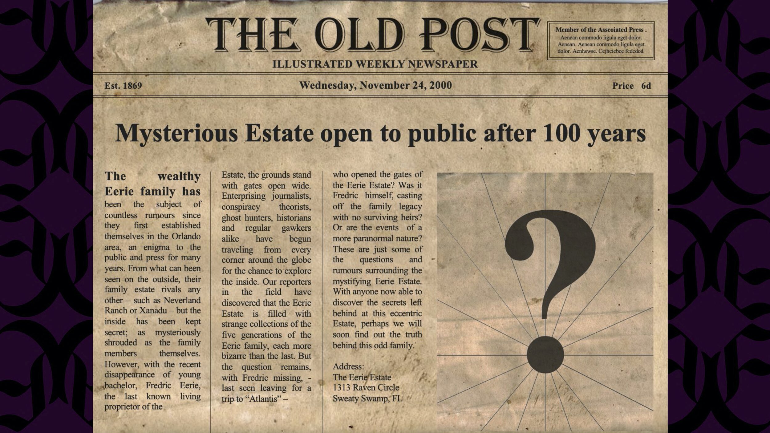
Mysterious Estate open to the public after 100 years
The wealthy Eerie family has been the subject of countless rumours since they first established themselves in the Orlando area, an enigma to the public and press for many years. From what can be seen on the outside, their family estate rivals any other - such as Neverland Ranch or Xanadu - but the inside has been kept secret; as mysteriously shrouded as the family members themselves. However, with the recent disappearance of the young bachelor, Fredric Eerie, the last known living proprietor of the Estate, the grounds stand with gates open wide. Enterprising journalists, conspiracy theorists, ghost hunters, historians and regular gawkers alike have begun traveling from every corner of the globe for the chance to explore the inside. Our reporters in the field have discovered that the Eerie Estate is filled with strange collections of the five generations of the Eerie family, each more bizarre than the last. But, the question remains, with Fredric missing - last seen leaving for a trip to “Atlantis” - who opened the gates of the Eerie Estate? Was it Fredric himself, casting off the family legacy with no surviving heirs? Or are the events of a more paranormal nature? These are just some of the questions and rumours surrounding the mystifying Eerie Estate. With anyone now able to discover the secrets left behind at this eccentric Estate, perhaps we will soon find out the truth behind this odd family.
Address: The Eerie Estate, 1313 Raven Circle, Sweaty Swamp, FL

There are 3 key influences that inspire and guide this concept. Firstly, we wanted to focus on an area of subjects that are not typically worked on in the industry, outside of the limited seasonal pop-ups. This would be narratives based on subjects that are usually considered scary, creepy and/or mysterious. When people think of these, they immediately think of Halloween haunted houses, which typically are reserved for young adults and up because of their frightening nature. However, there is actually a large market for these subjects in family-friendly entertainment, especially cartoons and movies. When these ideas are addressed and presented to children, they are stylized to reduce the potential “scary-ness” and many have actually become beloved narratives in pop culture. Just a few examples include The Addams Family (TV, several movies, animated movies); Hotel Transylvania; Scooby Doo (various cartoons and movies over several decades); The Corpse Bride; Casper; Monster House; and Ghostbusters.
Connected to this main influence is the environments presented in these narratives, which have a specific stereotype design that is seldom used in themed areas (unless, again, they are for haunted houses). This style is usually inspired by Victorian and Gothic architecture, as well as basic “run-down” or “antique” environments. Overall these give off a specific vibe of being haunted or scary in some way.
Lastly, we believe that there is immense potential for innovations in creating completely immersive, interactive experiences. And these experiences should not be limited to theme park environments. The ability to include these one-of-a-kind experiences in a hotel or resort is an area oft overlooked, and we believe that it is an area with great potential.
Overall, this leads to our goal for this hotel experience: combine these elements to create a unique “paranormal” space that is an immersive experience for all ages and abilities.

The abandoned Estate and its manor are a mix of Victorian, gothic and castle elements that have become a luxury hotel experience. The resort has many amenities including retail, dining, pools and other entertainment. In addition, the Estate is fully immersive, focused on several kinds of interactivity and involving Guests in the family’s mysterious narratives. The experience is aimed at all ages and abilities, especially family-friendly in nature by using designs that focus on fun rather than scariness. It has a cohesive atmosphere, relying on austere opulence and establishing itself as a stand-alone experience that can be enjoyed on its own without any connection to theme parks or other venues.

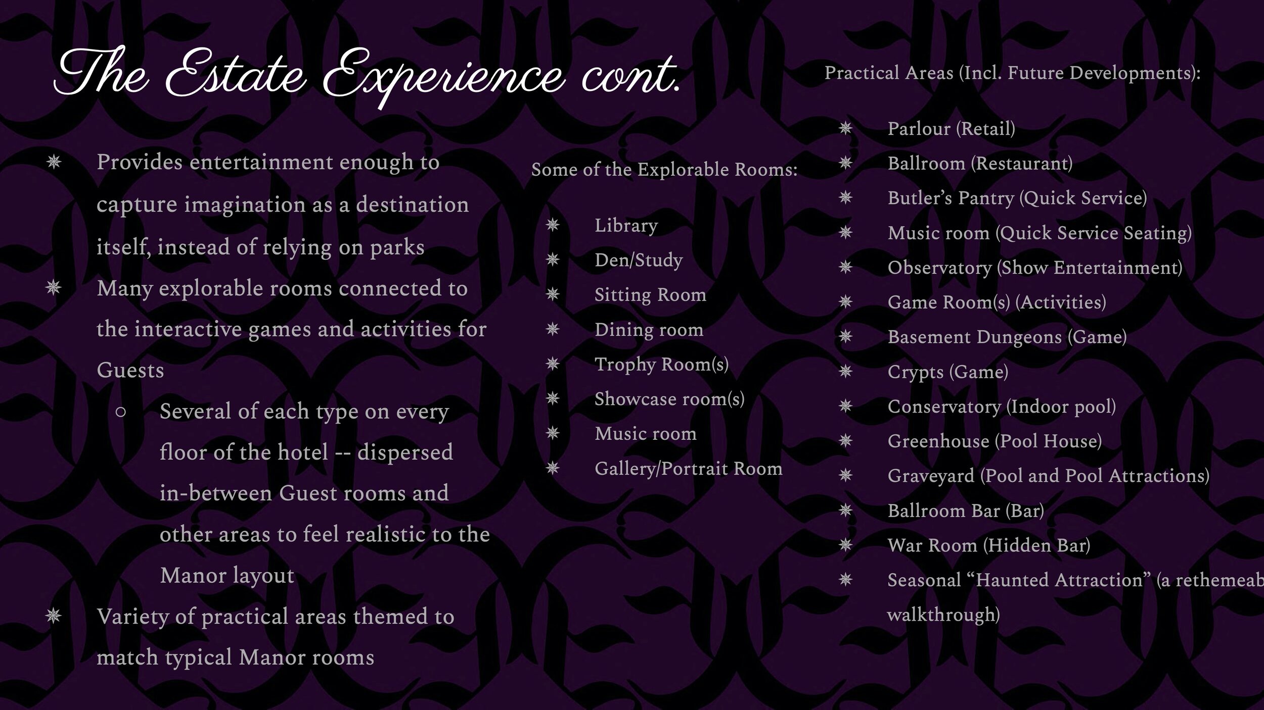
In order for the Estate to provide entertainment enough to capture imagination for an entire trip on its own, it has many explorable rooms that connect to the interactive games, activities and storyline that Guests can experience. Some of these rooms include libraries, dens/studies, sitting rooms, dining rooms, trophy rooms, showcase rooms, music rooms, gallery/portrait rooms and much more. Several types of each of these rooms are on each floor of the hotel, dispersed in-between Guest rooms and other areas to feel realistic to the manor layout.
In addition, there are a variety of practical areas that are themed to match typical Manor rooms at the Estate, some which will be covered in this concept presentation. The Parlor serves as a retail location; the ballroom is a formal restaurant; the butler’s pantry, a quick service food and beverage location with the music room used as seating; the observatory as a show entertainment venue; game room(s) as activities locations; the basement dungeons and crypts used for guided games; the conservatory holds the indoor pool; the greenhouse serves as a pool house; the graveyard has pool attractions; the ballroom bar is a bar connected to the den and ballroom; the war room is a hidden bar that Guests must discover on their own; and, finally, there is a seasonal “haunted attraction” - a re-themable walkthrough haunted house area.

The main narrative of the hotel is the mystery of the opening and abandonment of the Estate and what happened to its last heir, Fredric Eerie. Guests discover this story initially through marketing materials and can expand upon it through their exploration of the Estate. Fredric Eerie, lost in his intense research, discovered something that prompted him to leave the Estate open and unattended. Guests uncover new clues that lead to this lost heir, the story being uncovered and evolving over the course of time with the hotel opening. In addition, side stories and other interactions with the bizarre family members lead Guests to discover who they were, what their lives were like, where they went and why they collected what they did in the manor. Some of these family members include Uncle Vend, who pops up randomly at the hotel to sell objects for non-monetary objects Guests may have; Cousin Peekaboo, who always has her hands over her eyes and somehow collects invisible objects; Mother Minerva, a tarot and fortune reader who always seems to prejudice unfortunate events; and Aunt Isabel, who collects mirrors in an attempt to see herself again … even though she is a vampire.
Guests discover these details and more through quests, games and other interactive elements all throughout the Eerie Estate.

The most important goal of this experience is to immerse Guests through the use of interactivity that includes all their senses and levels of capability. A fully immersive and interactive environment is one that allows Guests to discover as much or as little as they want, at their own pace and in their own way. The Estate is full of explorable rooms, some open, some hidden, and provide a medium in which narrative is conveyed and uncovered. Each of these areas has many interactive opportunities that can be passive or active. Some elements can only be discovered through the Guest’s senses and their conscious search for it (Active interaction). These might include things such as opening a secret door with a torch; opening a book and discovering a noise; and listening to mysterious music to reveal story clues. Other elements are passively triggered by Guest presence or show-controlled to go off at various times of the day and night. These might include things such as stepping on a tiger rug causes it to roar and passing in front of a painting will trigger it to open its eyes.

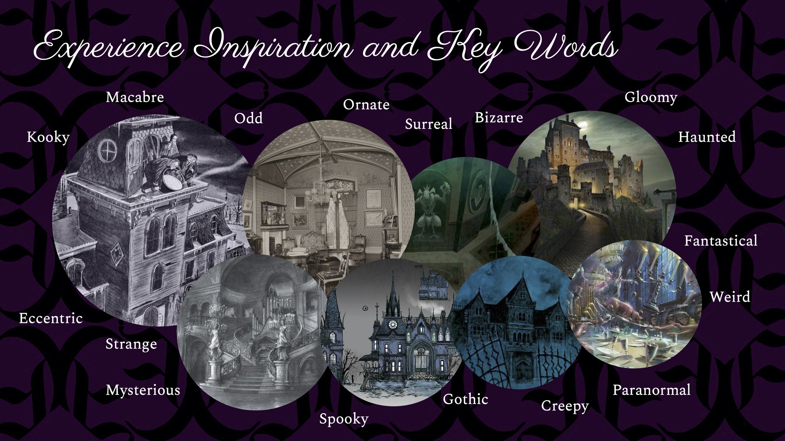
These are some of our initial inspiration images and keywords that we kept in mind throughout the entire design.

A cobbled stone drive leads to the mansion under a wide wrought iron gate, a dense fog hovering over the landscape. The gate features the family crest and a raven in an ornate arch topping stone pillars. The rest of the grounds are surrounded by a dilapidated stone wall.
The front grounds include a cobblestone drive and parking structure which appears to be the vine-covered remains of a previous structure, set slightly away from the house. In a small patch of grass in the middle of the circular drive up to the main entrance stands a sign, spelling out “Eerie Estate” in Blackletter Script. Beside it are a pair of sculpted statues, lit by lanterns to either side of the sign. The statues are of a man and woman, the woman tossing a raven into flight, and the man holding a long spyglass, apparently searching the sky.
The layout of the Eerie Estate is based on creating a mysterious illusion of space that the Guests will encounter as they go from the exterior to the interior of the hotel. From the outside, the structure does not seem large enough to be a hotel, but a well-sized Victorian styled mansion, which serves as this front facade. The rest of the structure hides behind the facade and well-placed landscaping and berms. The dense foliage and landscaping continues around the true structure, leaving a small space to the west for a formal garden.

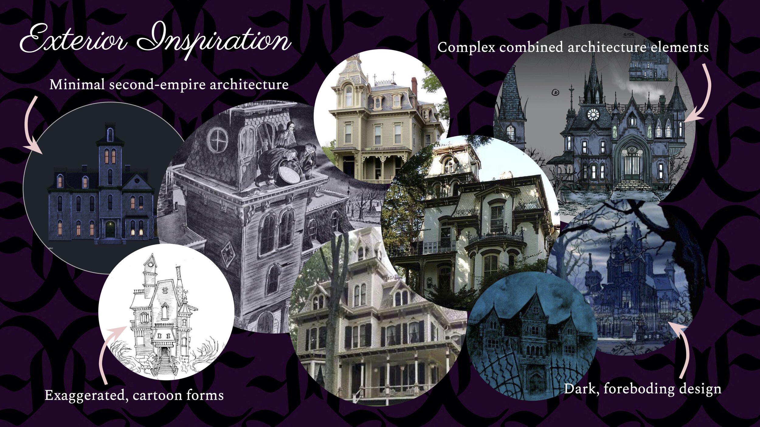
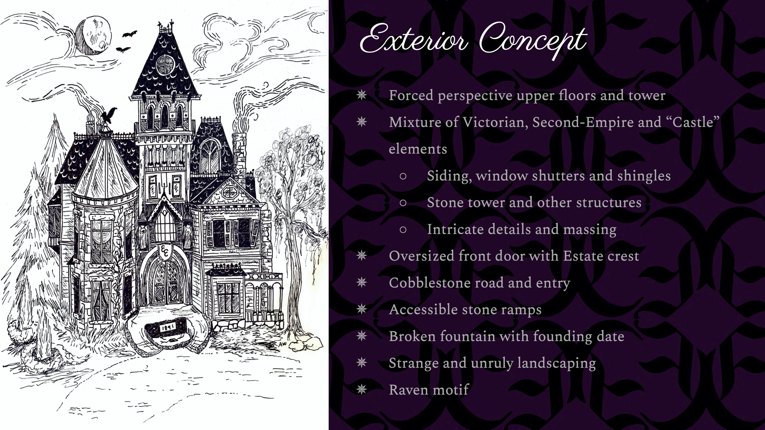
The front-facing estate facade is based upon the combination of several elements, but overall on minimal second-empire architecture. This architecture’s key features include mansard roofs, rectangular towers, and massing. In addition, it’s also characterized by its use of siding, shingles and large chimneys. This style of home is often associated with Victorian architecture and used throughout mainstream media as inspiration for “haunted” atmospheres. So, this design is based upon a mixture of elements from Victorian and second-empire architecture as well as intricate gothic details. This concept, though, will have just enough detailed elements to create full immersion into the experience. If the design is too complicated, it might become too intimidating to our Guests instead of inviting.
The hotel exterior also focuses on exaggerated shapes, which are often seen in cartoons or animation. This is to enhance the whimsy of the experience, especially seen in the eyes of children, rather than it being too scary. Lastly, dark elements and atmosphere will still play an important role in the story of the hotel, so enough will be included as needed, while still focusing on a family experience.

As Guests approach the hotel from the front yard grounds, they are greeted by this detailed estate facade. Surrounded by strange and unruly landscaping, the house looms over them, the tower seeming to stretch into the sky, a trick achieved with forced perspectives. The mansion is a mixture of eccentric styles, put together so the whole thing feels rather odd if it was anywhere else, but here, for this family, it matches their bizarre nature. Based on Victorian-era homes, large sections include siding and windows with shutters. Other areas suggest the older nature of the structure with stone towers that are closer to the design of castles. And intricate details in the architecture create the complexity seen in Second-Empire era buildings.
The entryway is dominated by a giant front door, with a stained glass window, the family’s crest and two statues looking down above. The front driveway is a cobblestone road that is dotted with a few weeds and patches of moss that have grown over the years. Stones that match the drive and towers of the mansion make up the accessible stone ramps leading to the entrance. A fountain, long-since dried up and broken, lies between the front stone entry, with a large plaque showing the construction date of the Estate. The landscaping surrounding the mansion entrance shows signs of attempted-taming, but to no avail; it’s unruly nature spills out at odd angles and shapes, the mixtures of flowers, weeds and thorns gradually taking over the area. Atop one of the manor’s towers sits an iron raven, a motif continued from their family crest and other illustrations.

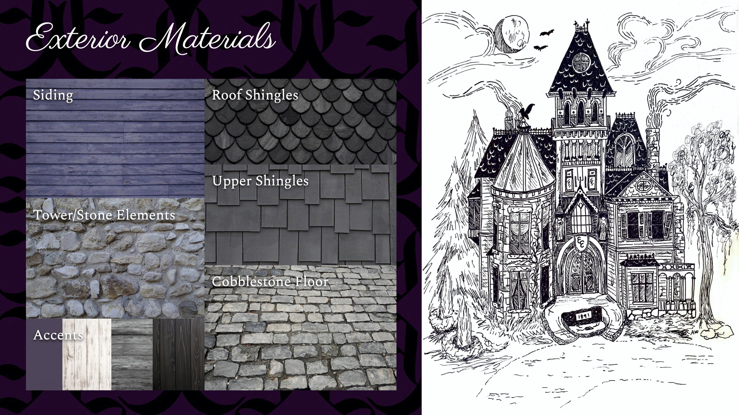
The main materials of the exterior are the siding and stone elements that make up the majority of the structure’s facade. The siding is a faded purple/blue color because we feel it comes across best as 1. something that is “spooky”, 2. a strong, memorable statement as Guests approach the hotel. For the stone elements, we want to match European-style medieval castles, so the stones are of varying colors and sizes (not all matching bricks) with plenty of mortar in between. On most of the roofs, black rounded shingles will be used, matching with Victorian era style. On upper roofing walls (attic type areas, gables, etc.), mismatched shape dark shingles will be used to keep with that “kooky” effect of the design. For the driveway, entryway, and ramps, a cobblestone flooring will be used that somewhat matches the colors and feel of the stone tower material, but with semi-regular shaping. Finally, for the various accent pieces throughout the exterior (windows, massing, doors, decoration, etc.), in addition to iron for the roof accents, a mixture of different woods in grey and dark brown will be used and the other main accent color will be a purple similar to the siding.

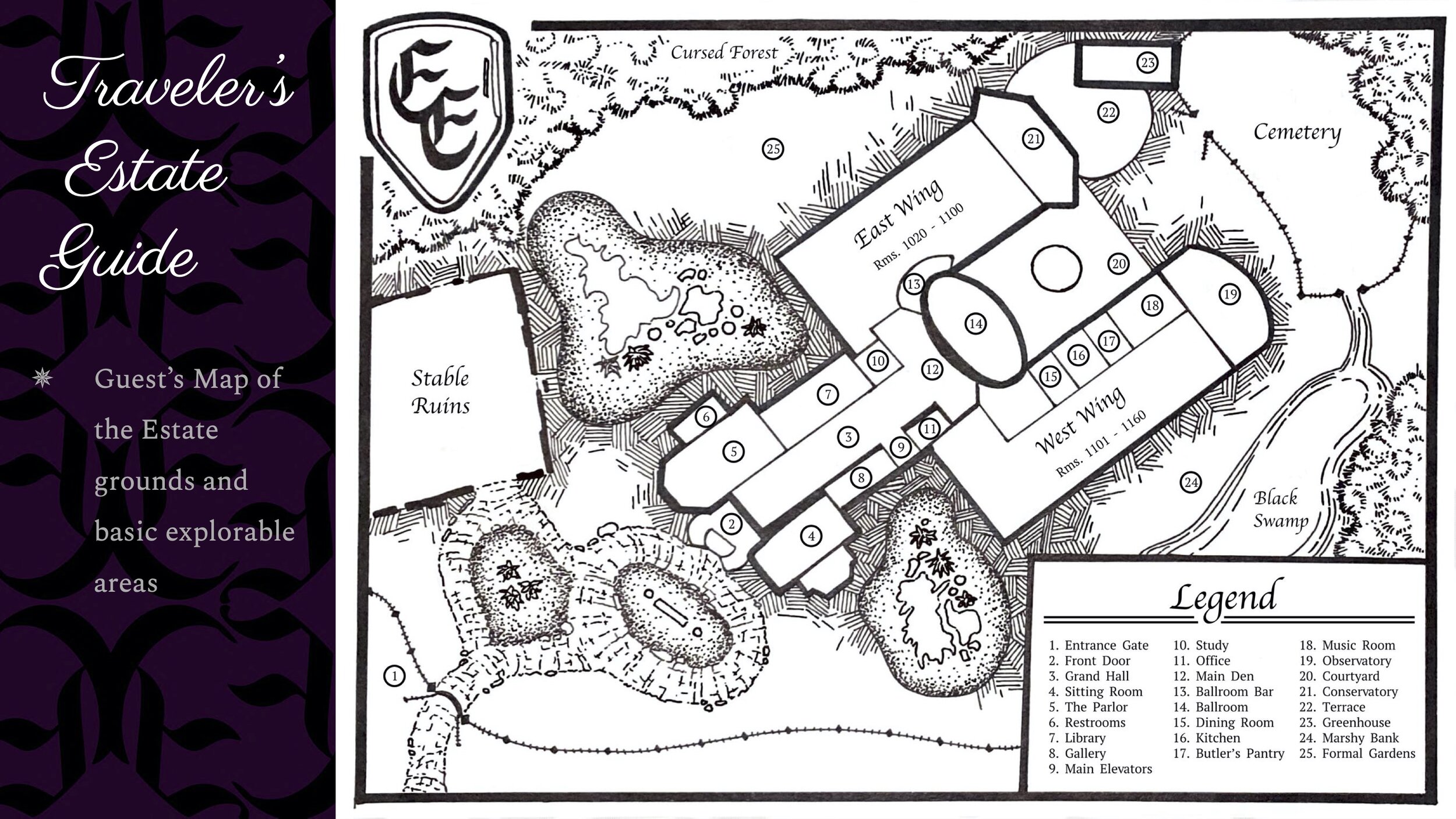
The Guest’s Estate Guide shows a layout of the Estate grounds and basic explorable areas, available in brochures or at reception. As Guests enter through the gate and fence line that defines the front of the Estate (1), if traveling by bus or other public transport, they can enter right through the front door (2); or, if they have their own transportation, they can park in the Stable Ruins - a parking garage set in the ruins of the old stables. Once inside, they enter into the Grand Hall (3) and through its gradour at the end of the hall they can see the Main Den (12) and large staircase leading into the Ballroom (14). The reception lies in the sitting room (4), on the right side of the entrance and on the left, the merchandise store: the Parlor (5). In addition, a set of public restrooms are in the store (6). Three explorable rooms lie right off the Grand hall, the Library, Gallery, and Study (7, 8 ,10). In addition, the main elevator banks and a business center (9, 11) sit next to the hall and Main Den. The elevators lead upward to the upper floors, which are dotted with themed explorable rooms.
The Ballroom, a restaurant and the Ballroom Bar define the middle of the Manor (13 and 14), looking out over the fountain in the Courtyard (20). In the West Wing, along with Guest rooms 1101 - 1160, additional explorable rooms include the Dining Room and Kitchen (15 and 16) which offer entrance to the floor below, to further entertainment (future update). There is the Butler’s Pantry, a quick service food and beverage offering (17) and the seating for the quick service, set in the Music Room (18). At the end of the hall is the Observatory (19), a theater-based entertainment offering. In the East Wing are rooms 1000-1100 and the Conservatory, an indoor pool area (21). The outdoor pool area starts at the Terrace (22) and includes the Greenhouse and Cemetery as future developments of pool attractions (23).
On the West side of the Manor is the Black Swamp, a pond with a waterfront area for Guests to relax, known as the Marshy Bank (24). Opposite, on the East side of the Estate is the Formal Gardens (25). To protect the integrity of the experience and keep it as immersive as possible, most of the grounds are surrounded by forest, landscaping and other devices to separate the Estate from exterior influences.

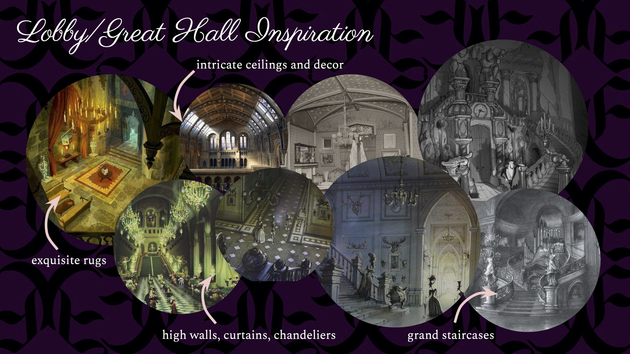
Inspired by the grand halls and opulent spaces in the Victorian era, particularly as with iconic structures such as the British Parliament building. Coffered or vaulted ceilings are widely used, as well as sweeping staircases and large hanging chandeliers. Each of these items and styles are leveraged to generate a sense of grandeur, a sizable space that could not possibly be housed in the exterior facade, despite that facade having front facing windows that can be clearly seen through into the side spaces. This provides the spaces on either side of the hall the light they need to keep from feeling too heavy or morose, while also gives the viewer the odd sense that the manor is both normal and abnormal from the drive curb.
Once inside, however, the design’s focus is to generate the feeling of depth within the viewer, the feeling that the hall is quite long, despite it not being so. Leading lines of rugs, tapestries, and furniture all contribute to this feeling, drawing the guest into the space and further into the main den beyond, which serves as the meeting point and main lounge area for the hotel. This caps off at the very end of the space with the grand staircase leading to the oversized Ballroom door, drawing the eyes up into the vast space of the main hotel interior, which is further accentuated by the portraits of the family hung on the wall above the door.

The lobby is divided into two parts. The first element the guest sees upon entering the building is a long Great Hall, filled with tapestries and paintings, extending fully into the facade and well past where the back of the facade should end and into the hotel itself. Touches of stone, wood and plaster are all present, lending to a the modernized “Gothic Castle” feel. Highly detailed sculpture, including the capitals on the pillars, and artistic statues are present, as well as iron lanterns illuminating the hall. Immediately to the right is the sitting room, where the check-in desk and back-of-house office are located.
Staff help direct guests into the formally furnished sitting room, taking care of the typical formalities, while the entrance to the first of the exploration areas tempts the remainder of the group with the curiosities of the family’s formal art gallery and an elegant music that echoes out into the area. The sitting room is darker, with more wood than the adjacent gallery and hall. After the group’s luggage is “taken by the spirits” up to their room, the guests may freely walk down the lavish stone hall, decorated with a soft red carpet and tapestries on the walls, down toward the grand staircase main ballroom.

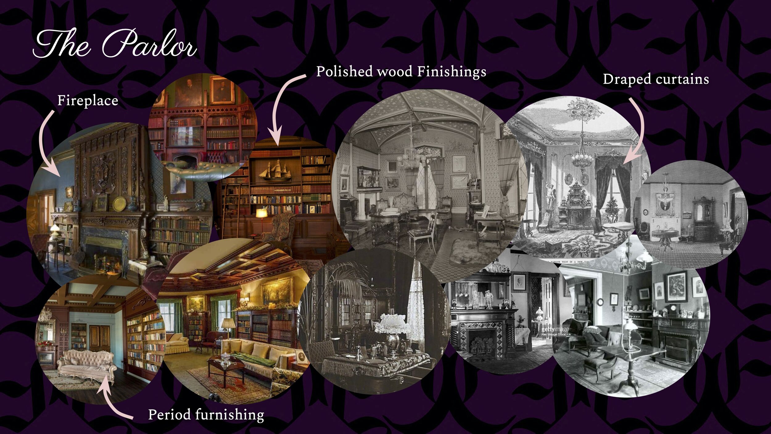
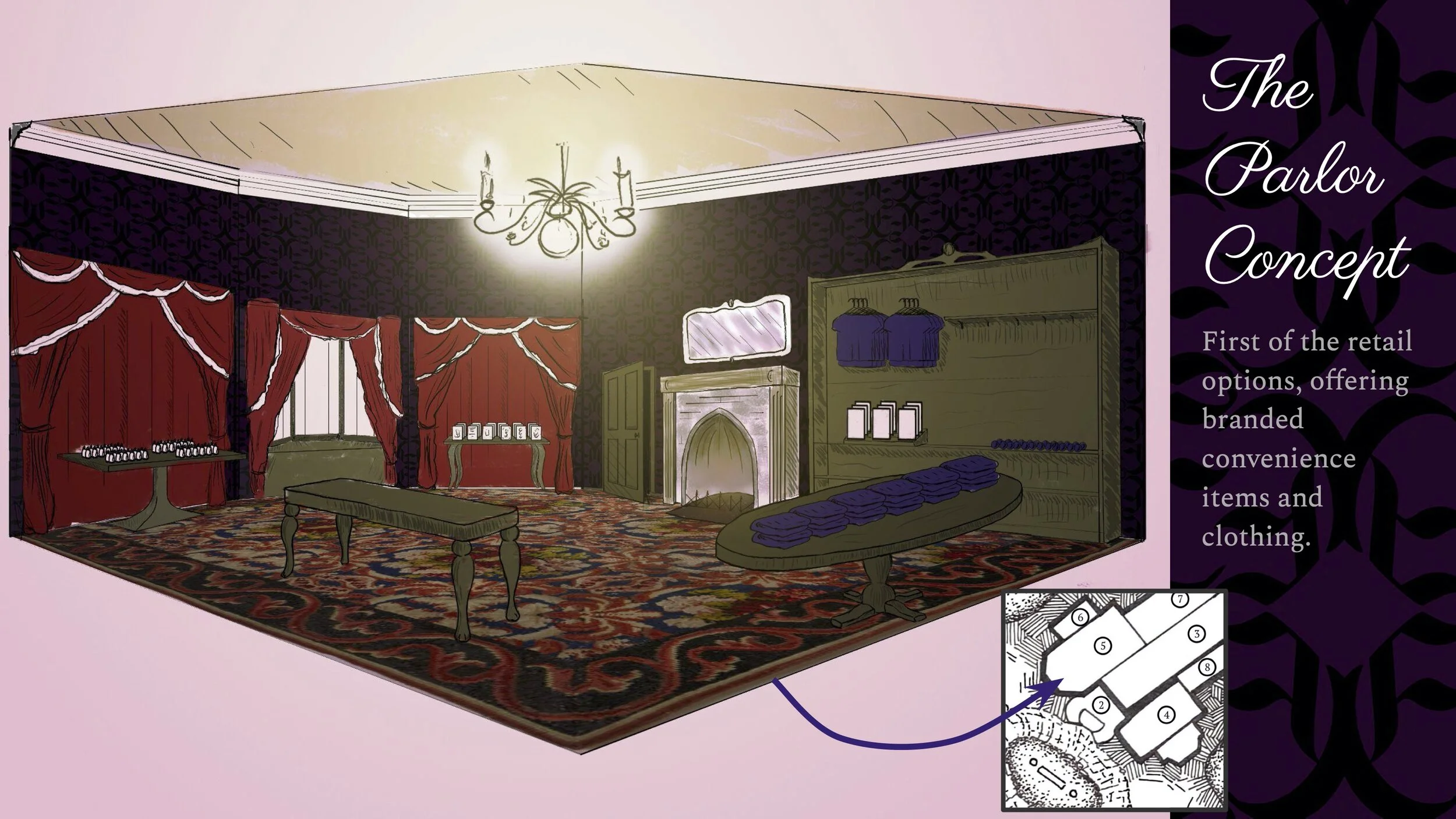
Focusing on inspiration from the more informal living spaces of the time. Furnishings are based on period pieces, with a mismatch of styling seen throughout. Bay windows face only the front of the outer facade, with no others beside, as the room is flanked by restrooms to the west and the Great Hall east. Solid woods, heavy curtains, and wall sconces are used to create an atmosphere darker than the adjacent Great Hall, but with enough accent lighting via well placed fixtures and the front windows to show the products. To further connect the rooms, vaulted ceilings are also used, though with a much less dramatic arch. A typical fireplace is used, with products taking the place of the typical knick-knacks that would have been displayed about the room during the period.

The Parlour offers a retail space where forgotten items are easily replaced and branded amenities may be purchased. Large tables and wall-filling bookcases are used for the primary product display, lit via wall sconces and hidden LED lights for the book case interiors. Smaller side tables are also used for product display, though for products with a lesser priority. A small number of chairs are placed in the center of the room to complete the theme of the room, and for those waiting for shoppers or party members visiting the adjacent restrooms. Staff are free to roam about in the open floor plan and have the register hidden within a heavy desk to one side of the room, screens hidden within books on the desk.

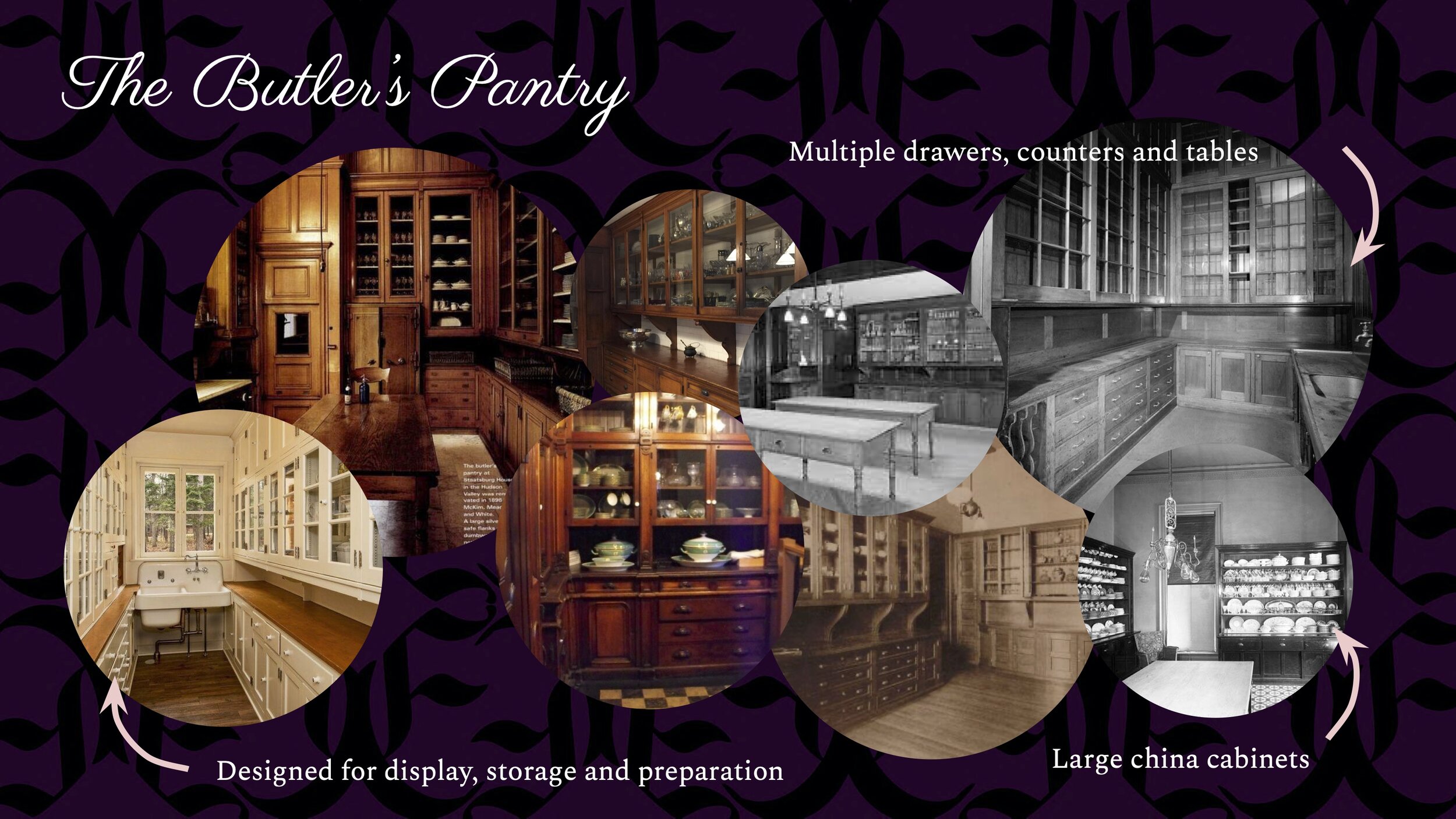
The Butler’s Pantry is a quick service food and beverage location at the Estate. Historically, a butler’s pantry, also known as a scullery, was a space to store china, silver, and other expensive dining pieces that do not belong in the kitchen itself. These spaces are often located just off the kitchen and dining room and are also used for staging meals. In our Butler’s Pantry, Guests can grab quick meals from the array of foods that the butlers are “preparing” for the dining room as well as snacks found in regular pantries.
Many set-ups of historical butler’s pantries are similar and focused on having three main areas: display, storage and preparation. So, the room is usually full of many cabinets, sets of counters and tables (often the entire room is cabinets). In addition, some standalone china displays can be included to show off the family’s collections. Since the room is mainly focused on preparation, not for guests or the wealthy family to even see often, they are not decorative in nature. But, the cabinetry and displays within are still given enough thought to accent the expensive china within.

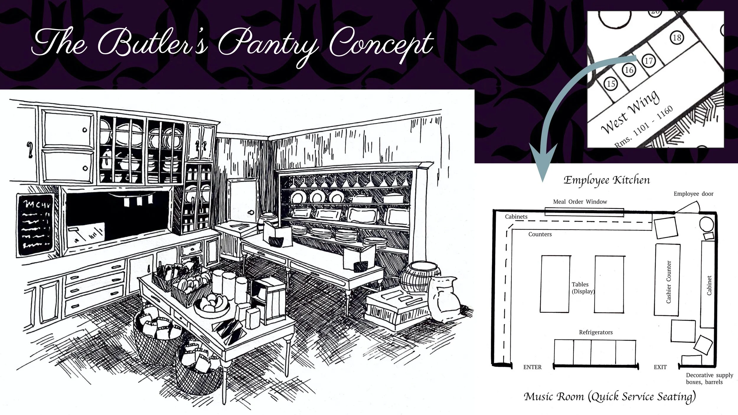
The floor plan of the Butler’s Pantry mirrors the inspiration images - walls filled with cabinets and counters and preparation tables in the center. Two archways lead to the seating for the service, which is based on a music room setting. In between the archways are refrigerators which can hold drinks and snack items that need to be kept cold. Cabinets and shelving on the left wall have other to-go snacks and meals (non-refrigerated). On the north wall, an ordering window is built into the cabinetry that looks into the employee kitchen. Here, Guests can order hot meals that may take a few minutes to prepare. Tables in the center of the room have additional snacks and ready-to-go items. The right side of the room is where the “butlers” are preparing the pantry and taking inventory on their own table, with cabinets of china and boxes of supplies around them. This is really the check-out counter, with registers themed into large books labeled “Inventory.” Once Guests have picked out their items, they can checkout and eat in the Music room -- if they ordered hot food, it will be brought to their table by the staff.

Although our goal is to immerse Guests into a time period and genre that is not normally focused on, we also want them to have a comfortable stay with amenities and environments that they expect from hotels in the modern era. So, our rooms are a balance between historical elements from the Victorian eras; the paranormal elements from our design; and contemporary hotel standards. Our focus is on creating Guest rooms that are themed enough to feel as though they belong in the grand Estate, but do not feel “outdated,” “old-fashioned,” “shabby,” “dingy” or “run-down” (all of which are words commonly used to describe hotels in low-rating reviews).
In the Estate there will be both Standard rooms, and Deluxe rooms. The standard rooms will have a basic theme matching bedrooms of the Estate while the Deluxe rooms will be inspired by various rooms and themes seen in mansions, “haunted” houses and other key influences. (more detail on a later slide). In addition, interactive elements are included in the Deluxe rooms. Guests can see spirits in mirrors; moving parts of paintings or pictures; hear various noises and music playing; and much more. While these are automatically turned on and triggered in their rooms, there is the option to make the rooms “lifeless”, or turning them off if they are too frightening, especially at night.

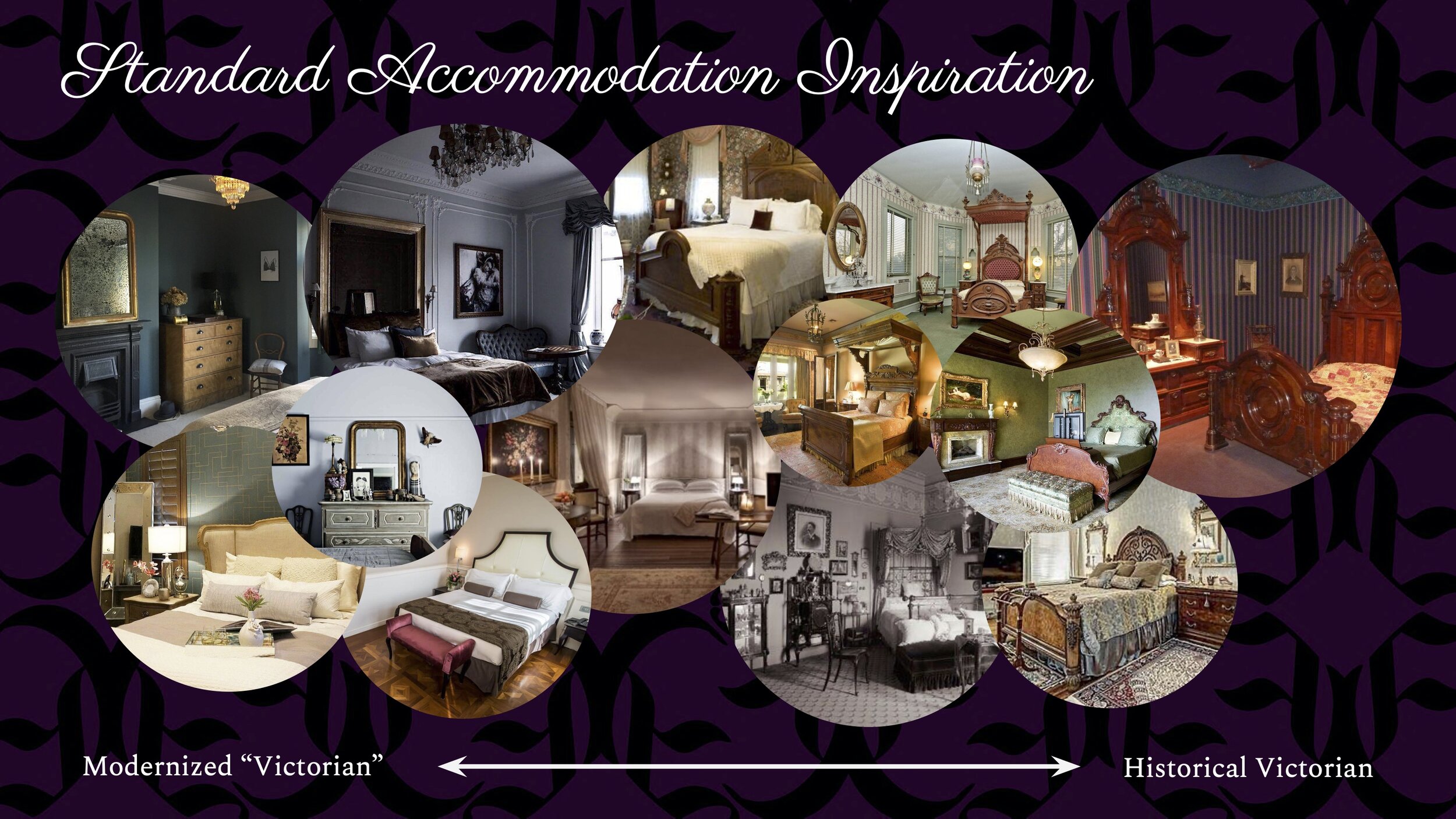
To achieve this balance in the overall design of rooms, especially the standard level rooms, we look at this spectrum of historical Victorian design vs. the sort of modernized “Victorian” interior trends. On the historical end, rooms can feel heavy because of the dark, intricate beds and furniture in addition to the wallpaper and rugs. But some of these details we want to keep in mind to accurately suggest that these rooms belong in the old Estate manor such as the wooden bed frames, wallpapers, lighting fixtures, dressers and mirrors. On the other side, in modern trends, elements of the Victorian era are used as grand, intricate pieces, set against simpler rooms. The goal of the standard guest rooms is to find a medium between these two inspirations. If we go too historical, the rooms will not feel comfortable and perhaps be too “old-fashioned.” On the other hand, if we go too modern, the rooms will feel “stylish” and not feel as if they belong in the rest of the Estate.

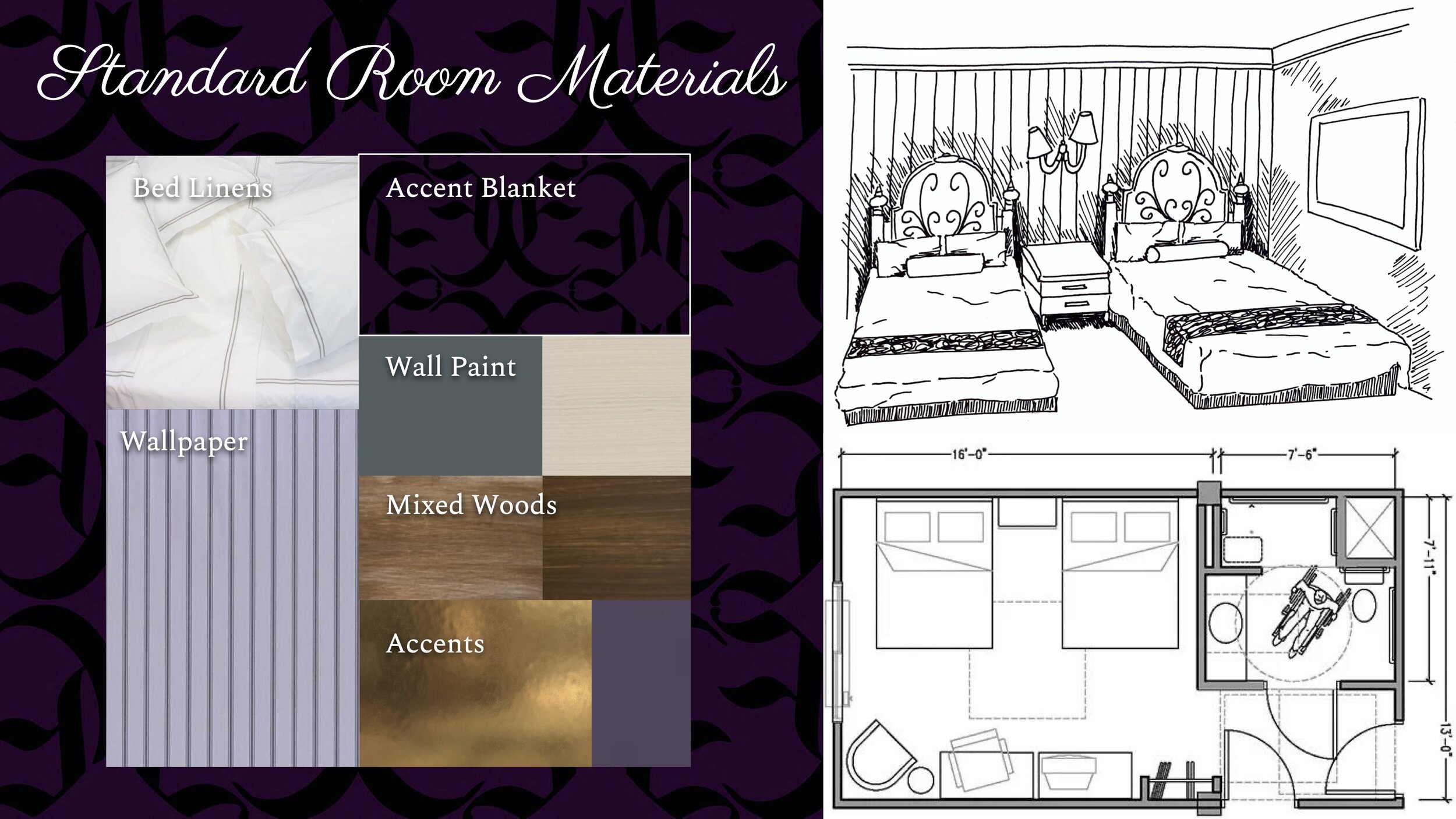
The Standard rooms will have one accent wall of striped wallpaper, inspired by historical Victorian bedrooms, and the other walls a plain painted color. The headboards of the beds will be similar to the intricate wooden ones from the inspiration images while the rest of the bed will be a simplistic base for comfort and accessibility. In addition, the beds have modern sheets and beddings, with only the accent blanket being a pattern matching the Estate’s theme. Sconce lighting sits aboves the wooden nightstand that accents both the intricate wooden headboard but also the simplistic modern stylings.
Every room will be ADA accessible, shown in the sample floor plans (which are pretty typically layouts for hotels). Lastly, the bathroom will have similar stylings to the main room, having a few touches of historical elements but combined with modern plumbing. Bronze fixtures will accent this theme very well.

The materials used in the Guest rooms will reflect the luxury of the hotel as well as its Victorian theming. The bedding is rich white linens with the accent blanket that matches the purple Estate themed pattern. On the main wall, behind the beds, is a purple-blue striped wallpaper. The other walls mainly have a beige paint, with a few having a dark teal color. Throughout the room, on other furniture pieces, and the beds, is a mixture of dark and light woods. Lastly, the accents on other objects and light fixtures will be materials and colors such as bronze/gold and purples, greens, blues and beige.

The Deluxe rooms at the Estate are all about furthering the Guest’s immersion into the narrative of the Eerie family. Instead of normal bedrooms, they are based upon other rooms that are common in the manor. For example, in a Library Deluxe room, most of the main walls will have bookshelves, including children’s bunk beds built into them. Books and other decorations on the shelves will hold additional clues to the mysteries of the manor. In Music Deluxe rooms, furniture and paintings will have motifs of musical instruments and melodies from the instruments can be heard when they are touched. There will be many additional deluxe type rooms, the majority based upon the collections of the various family members over five generations.
In addition to the theming in each of these rooms, interactivity based on the rest of the Estate will be included. Guests can see spirits in mirrors; moving parts of paintings or pictures; hear various noises and music playing; and much more. While these are automatically turned on and triggered in their rooms, there is the option to turn them off if they are too frightening, especially at night as well as an option to increase or decrease the intensity/frequency of the encounters.

In addition to the concepts shown in this presentation, there are many areas of the Estate that are planned for future development. In the rear part of the grounds, a themed pool and pool amenities will be incorporated as a conservatory, greenhouse, terrace and cemetery. Other additional yard elements will include gardens, a courtyard, a swamp (a water feature) and a hedge maze. Also, a full work-up of the interactive events, games and activities will show all of the ways Guests can immerse themselves in the story of the Eerie Estate. The major section of this will be guided games in the crypts, tunnels and dungeons as well as a re-themable “haunted house” walkthrough area. There will be more explorable room concepts created, especially hidden rooms, that Guests must discover by solving riddles or doing other quests at the manor. Lastly, the concept for the ballroom, a sit-down dining location, and attached bar will be created, along with a hidden bar and other practical experiences.

Thank you for viewing our Eerie Estate concept!
Concept by Jax Robinson and Arianna White
TEA Summer Competition 2021 (June Submission)
